Client:
AeroSound
Client:
AeroSound
Duration:
5 weeks
Duration:
5 weeks
Year:
2025
Year:
2025
Categories:
Brand Identity
Website Design
Physical Product Design
Marketing Campaigns
Photography
Video Production
Tools Used:
Framer
Figma
Frameship
Creative Cloud
React.js
Chat GPT
Our team mates who took part in this project


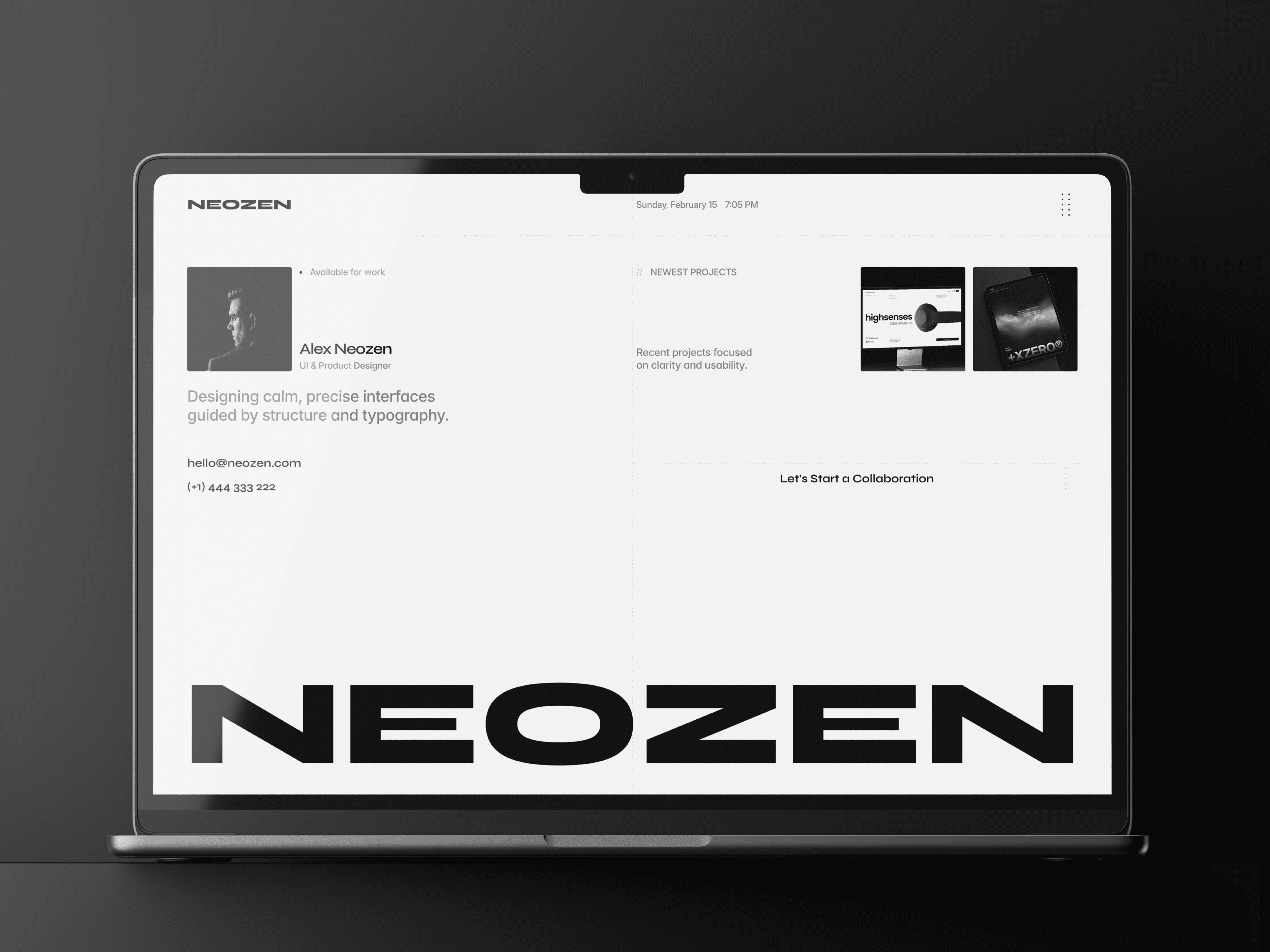
AeroSound is a high-end website template designed for premium consumer technology products, with a strong focus on sound, motion, and product storytelling. Originally crafted for headphones, the layout and structure are flexible enough to support speakers, wearables, smartwatches, VR devices, and even fashion or lifestyle products.
Important
To unlock the full potential of this template, an active Shopify store is required for seamless integration. Additionally, the Frameship.io plugin license is essential to connect Framer with Shopify's e-commerce functionality. As a bonus, you'll receive a 10% discount code after you remix this template to make getting started with Frameship even easier.
Approach
From the beginning, this project was approached as a real commercial product, not a visual experiment. The goal was to design a flexible, production-ready website template that could serve premium consumer technology brands while remaining adaptable across product categories.
Rather than designing for a single device, the structure, interactions, and content hierarchy were built around principles of clarity, modularity, and storytelling. Every section was treated as a system — capable of standing on its own or evolving alongside different products, markets, and brand voices.
The approach combined:
Strong visual hierarchy
Modular CMS-driven content
Performance-aware interactions
A balance between editorial storytelling and e-commerce efficiency
Vision and Inovation
From the beginning, this project was approached as a real commercial product, not a visual experiment. The goal was to design a flexible, production-ready website template that could serve premium consumer technology brands while remaining adaptable across product categories.
Rather than designing for a single device, the structure, interactions, and content hierarchy were built around principles of clarity, modularity, and storytelling. Every section was treated as a system — capable of standing on its own or evolving alongside different products, markets, and brand voices.
The approach combined:
Strong visual hierarchy
Modular CMS-driven content
Performance-aware interactions
A balance between editorial storytelling and e-commerce efficiency
Identifying Unique Challenges
Several key challenges defined the project early on:
Template Versatility
The design needed to work for headphones, speakers, wearables, smart devices, and even fashion-adjacent products — without feeling generic.Complex Technical Storytelling
Modern consumer tech products are deeply technical. Translating advanced features into content that feels accessible and engaging required careful copy structure and layout decisions.Balancing Interactivity and Performance
Rich visuals and animations needed to feel smooth and premium without compromising load times or usability.Seamless Shopify Integration
The template had to integrate cleanly with Shopify via Frameship while maintaining full design control.
Resolving Complex Problems
Each challenge informed specific design and technical solutions:
Modular Sections
Features like Sound Tech, Technical Specs, and Lifestyle were built as independent modules that can be reordered, removed, or repurposed.Scroll-Based Storytelling
Interactive elements such as image sequences and feature reveals are driven by scroll, creating engagement without forcing users into fixed timelines.CMS-Driven Content Architecture
Technical specifications, blog posts, and feature sections are all CMS-powered, allowing non-technical users to update content effortlessly.Performance-First Motion
Animations are lightweight, purposeful, and optimized to enhance clarity rather than distract.


User-Centric Design
At its core, the project prioritizes how users read, scroll, and decide.
Key user-centric principles include:
Clear entry points for different user intents (explore, compare, purchase)
Predictable navigation patterns
Strong typographic contrast for effortless scanning
Logical progression from inspiration → understanding → conversion
Rather than forcing users to “discover” content, the layout guides them naturally, reducing cognitive load at every step.
Meeting User needs
The template supports multiple user journeys:
Curious Explorers
Engaged by visual storytelling, lifestyle imagery, and editorial sections.Detail-Oriented Buyers
Served through structured technical specs, sound technology breakdowns, and FAQs.Ready-to-Purchase Users
Clear CTAs, integrated cart behavior, and frictionless Shopify checkout flows.
This layered approach ensures the experience remains effective regardless of how deeply a user wants to engage.
Detailed Pages and Features
The template includes thoughtfully designed, production-ready pages and components:
Product landing pages with scroll-based interactions
Sound Tech sections using bento-style layouts for complex concepts
CMS-powered Technical Specs and FAQs
Editorial Blog system for brand storytelling
Lifestyle sections that emphasize real-world use
Integrated Shopify Cart Layer via Frameship
Legal, policy, and support pages built for real commerce needs
Each page follows the same design language, ensuring consistency across the entire experience.
Accessibility and Optimization
Accessibility and performance were treated as foundational, not optional.
Key considerations include:
High color contrast and readable typography
Clear focus states and predictable interaction patterns
Logical heading structure for screen readers
Optimized image handling and motion constraints
Responsive behavior across desktop, tablet, and mobile
The result is an experience that feels premium while remaining inclusive and performant.
Conclusion
This project represents a holistic approach to product website design — where branding, storytelling, usability, and commerce are treated as one cohesive system.
Rather than locking users into a single product type or aesthetic, the template is designed to scale, adapt, and evolve, making it suitable for a wide range of premium consumer brands.
It’s not just a template — it’s a foundation for products that value:
Craft
Clarity
Performance
And long-term relevance
If you want, next I can:
Turn this into a formal case study page
Rewrite it for LemonSqueezy / Polar product listings
Or adapt it into a portfolio presentation narrative


Check also other projects of ours

You bring the vision
We don’t just make things look good. We help you create systems, stories, and experiences that matter.
Make the first move — we’ll take it from there

You bring the vision
We don’t just make things look good. We help you create systems, stories, and experiences that matter.
Make the first move — we’ll take it from there

You bring the vision
We don’t just make things look good. We help you create systems, stories, and experiences that matter.
Make the first move — we’ll take it from there
Newsletter
Stay Ahead
with +XZERO®
Join our newsletter for fresh insights, trends, and stories that fuel creativity and innovation.
Enter your email, hit subscribe →
Newsletter
Stay Ahead
with +XZERO®
Join our newsletter for fresh insights, trends, and stories that fuel creativity and innovation.
Enter your email, hit subscribe →
Newsletter
Stay Ahead
with +XZERO®
Join our newsletter for fresh insights, trends, and stories that fuel creativity and innovation.
Enter your email, hit subscribe →

